UI / UX / Web Design / HTML & CSS

KōCH

An operating hub for personal trainers, designed to bring client management, programming, communication, services, and business workflows into one coherent system.

KōCH laptop and phone mockup

Case Study

From scattered trainer tools to one calmer coaching workflow.

KōCH started from a practical operational problem: personal trainers were running their businesses across too many disconnected tools.

The Challenge

Personal trainers used separate products for schedules, payments, files, client communication, and exercise tracking. The product needed to connect both sides of the service: trainers managing a business and clients following a program.

The Approach

I helped shape the product around a repeated coaching loop: understand the client, plan the program, deliver the session, track progress, and follow up.

Step 01Research
Step 02Ideate
Step 03Prototype
Step 04Web Design

Platform Strategy

The solution separated the experience into two connected surfaces: a web platform for trainers to manage services, clients, billing, and programs, plus a mobile app for clients to communicate, review schedules, and follow exercises.

The Outcome

The final direction clarified KōCH as a trainer-facing operating system supported by a client mobile app and a promotional website for the product launch.

Research context

The project lead owned a successful one-on-one fitness club in Toronto and collaborated with multiple local fitness clubs. That gave us direct access to trainers with real business workflows and helped ground the product direction in daily operational pain points.

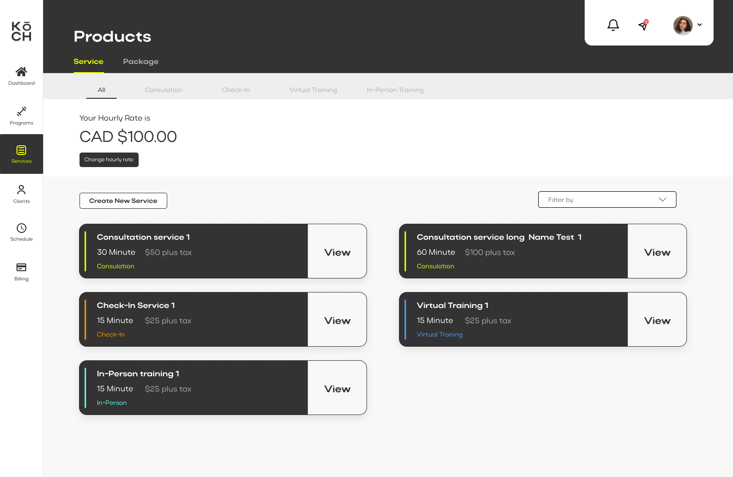
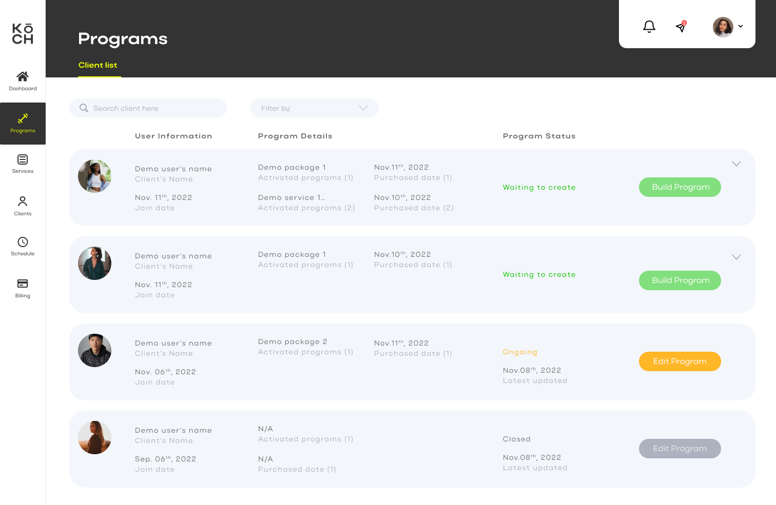
During observation, I studied how trainers moved between Excel, Messenger, Zoom, Outlook, Google Drive, WhatsApp, PayPal, and other tools. The repeated pattern was clear: trainers were not missing effort, they were missing one connected workspace.

My role

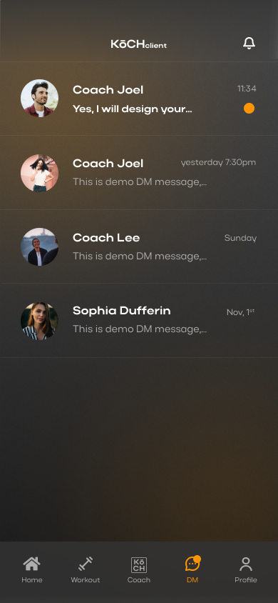
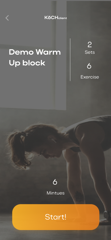
I worked as a UX/UI designer on a two-designer team. My responsibilities included improving existing web screens, designing mobile user flows and UI, aligning feature decisions with another designer, and working with the development team so design decisions could move toward implementation.

5Personal trainers observed
20Trainers invited for prototype feedback
2Connected product surfaces
1Promotional website design

Evidence & Screens

The trainer web platform turns scattered work into structured operations.

These artifacts show how the trainer-facing platform organizes clients, services, billing, and program building into one operating surface.

Personal training research context
Research contextUnderstanding the day-to-day rhythm of personal trainers helped frame the product around real business needs.
KōCH prototype feedback data
Prototype feedbackFeedback from trainers shaped priorities for the core web platform.
KōCH desktop dashboard screen
Trainer dashboardA desktop overview for clients, schedules, progress, and business tasks.
KōCH services screen
ServicesTools for trainers to present and manage service offerings.
KōCH build program screen
Program buildingA structured workflow for planning and delivering training programs.

Mobile Client App

The mobile app completes the two-sided product.

The client app explains the other side of the platform: clients needed a lightweight way to communicate, check schedules, browse services, and follow exercises without carrying the whole trainer dashboard.

Designed for clients in motion.

The web platform supports trainer operations; the mobile app supports the client experience. I designed mobile flows for messaging, calendar review, marketplace browsing, and exercise guidance so the client side could feel focused and easy to return to during training.

Together, these screens frame KōCH as a connected service ecosystem instead of a single website or dashboard.

KōCH mobile home screen
HomeClient progress and daily entry point.
KōCH mobile messaging screen
MessageCoach-client communication in one place.
KōCH mobile calendar screen
CalendarTraining schedule and upcoming sessions.
KōCH mobile market screen
MarketBrowse trainer services and plans.
KōCH mobile exercise screen
ExerciseGuided movement and workout context.
KōCH mobile app mockup
App frameMobile presentation for the client product.

Promotional Website

A launch website for trainers, clients, product story, and feedback.

This horizontal collection shows how the launch site presented KōCH across acquisition, client education, product story, contact, and feedback moments. The visual language is intentionally different from the portfolio page because it reflects the original KōCH brand: dark fitness energy, yellow-orange action cues, and product-led marketing.

KōCH promotional website home page
Home pagePositioning KōCH as one product for simplifying a personal training business.
KōCH client promotional page
KōCHclientIntroducing the mobile client experience and its core benefits.
KōCH about page
AboutExplaining the founder story and product motivation.
KōCH contact page
ContactFeedback and inquiry flow for early users and potential partners.
KōCH promotional website additional page
Additional pageSupporting launch content and product communication.

Reflection

What I would carry forward.

KōCH was a strong lesson in managing complexity without letting the interface inherit that complexity.

Next Case

Connect U

A campus community product focused on helping students find like-minded people and local activity information.

View Connect U