The Challenge
Users needed a way to scan, store, search, and understand receipts without relying on small visual details or fragile manual organization.
UX / UI / Accessibility
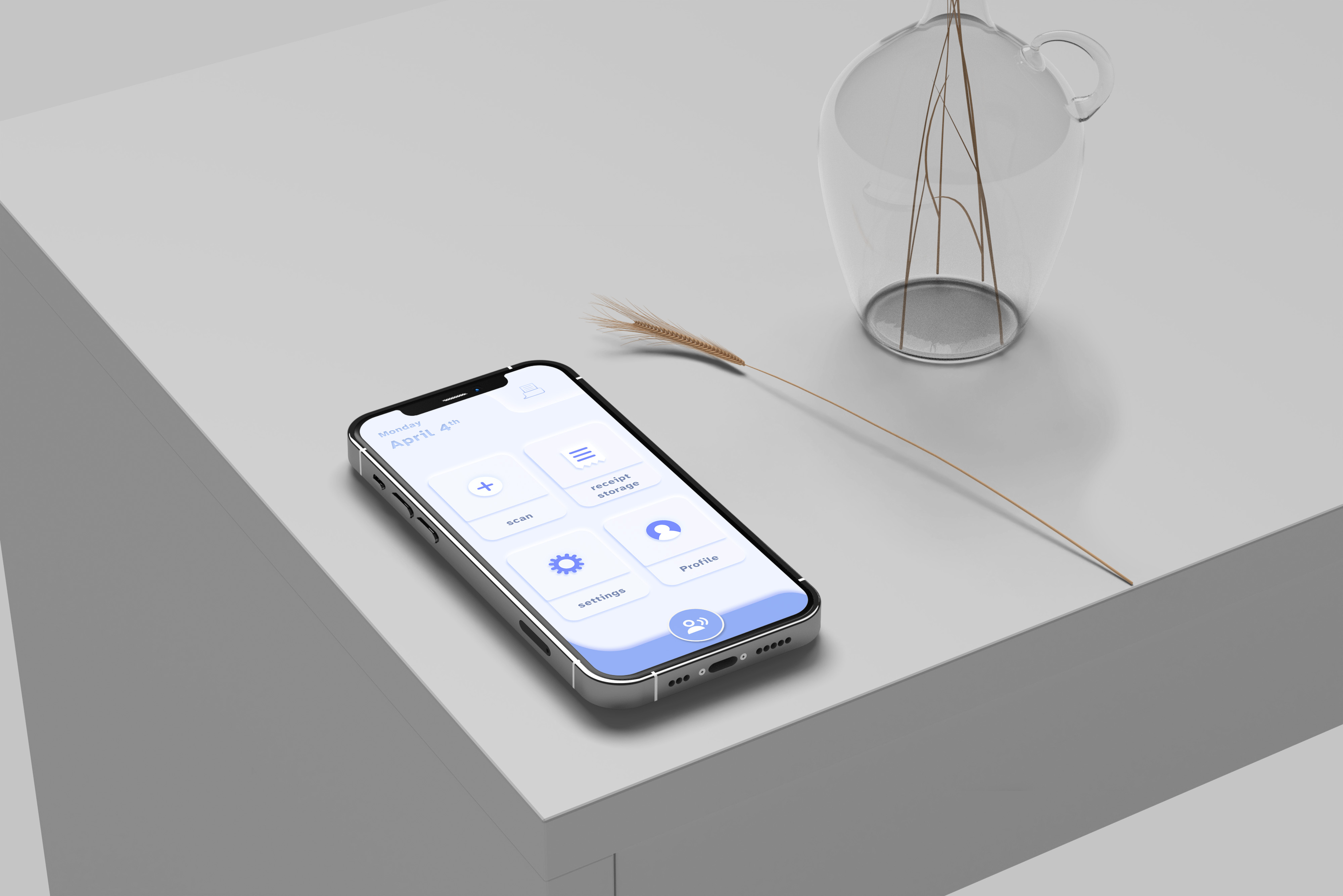
An accessibility-focused receipt management concept designed for visually impaired users who need a clearer, more recoverable way to scan, store, and retrieve receipts.
Case Study
Receipts are small, inconsistent, and easy to lose. For visually impaired users, that everyday task becomes an accessibility problem.
Users needed a way to scan, store, search, and understand receipts without relying on small visual details or fragile manual organization.
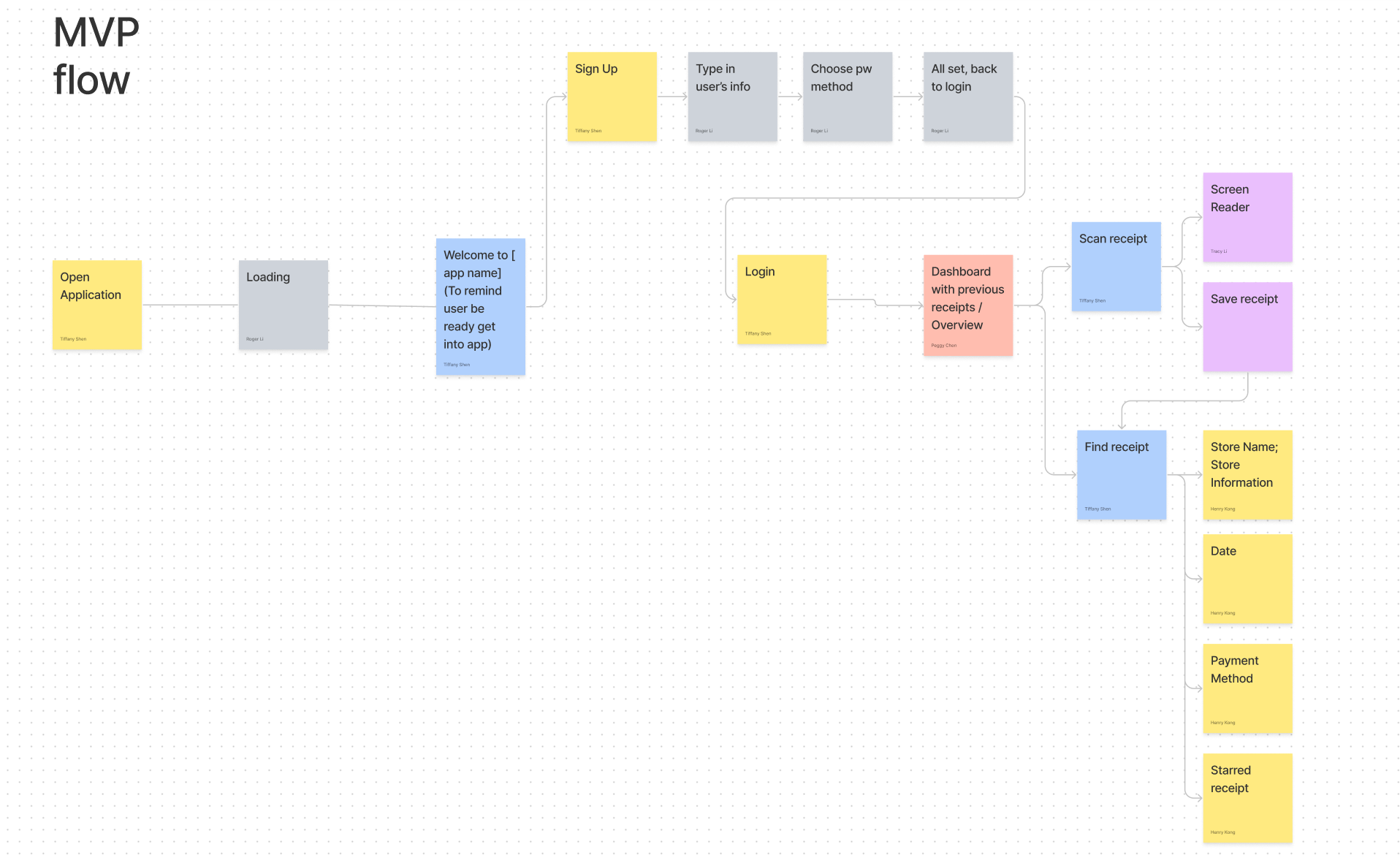
We split the project into research, problem definition, ideation, wireframes, business planning, prototype design, and user testing.
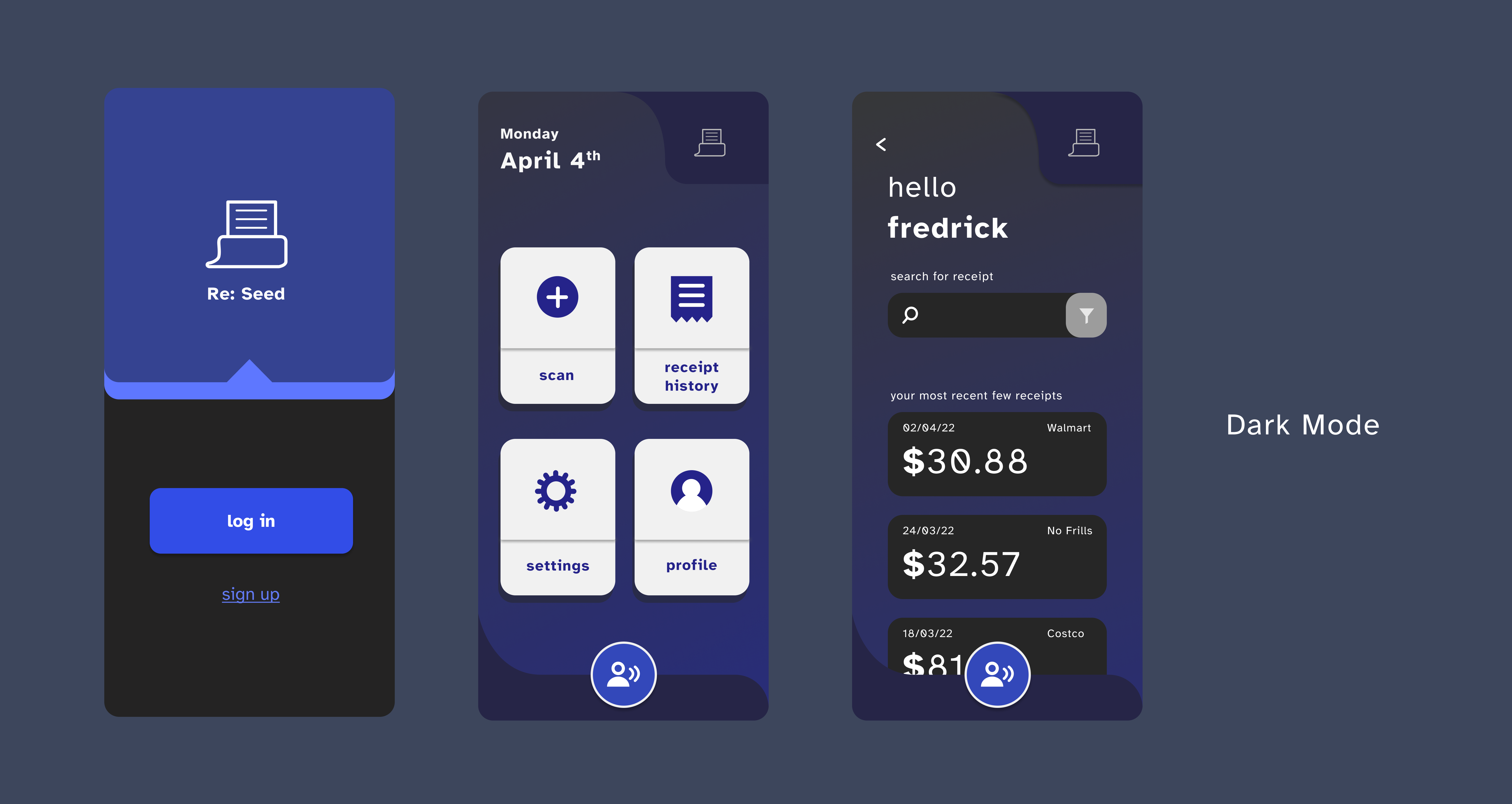
The design prioritized large visual separation between functions, simplified screens, voice-friendly retrieval, high-contrast modes, and explicit confirmation so users could trust where each receipt went.
The project showed that receipt management for visually impaired users is not only a contrast problem. It is a structure, confidence, and recoverability problem. The final prototype improved task clarity while exposing specific navigation and control patterns that still needed refinement.
We clarified visual impairment as a broad target group that included myopia, glaucoma, blurred vision, and colour blindness. The primary product focus became users who experience blurred or low vision while trying to read, organize, and retrieve receipts.
Through interviews, we learned that some participants relied on enlarged fonts while others used voice reading tools. A recurring issue was that many apps did not visually separate functions clearly enough, making accurate tapping and retrieval difficult.
I contributed to UX research, UI design, business planning, and prototype refinement. As the project developed, I also helped translate accessibility findings into interface decisions and supported the business plan around funding, subscription, and sustainability.
Research to Prototype
The strongest design moves came from making the flow simpler, the functional areas more distinct, and the recovery path clearer.
.png)
.png)


Testing & Learning
Testing showed that users appreciated the simple structure, but also revealed moments where common UI assumptions were not accessible enough.
Participants agreed that the color contrast was easier on the eyes, the functional separation was clear, and the simplified interface reduced mistaken taps.
Some users did not immediately understand the filter button as a dropdown, and the top-right home button contradicted expected navigation habits.
Accessibility became more concrete when I stopped thinking only about legibility and started thinking about confidence: how a user knows where they are, what happened, and how to recover if something goes wrong.
Next Case
A working macOS + iOS alpha exploring AI-assisted personal bookkeeping, quick capture, desktop review, budget management, and Notion-backed records.
View Rooger